Cheyenne Mountain Zoo Case Study
Timeline: September to December 2025 (3 months)
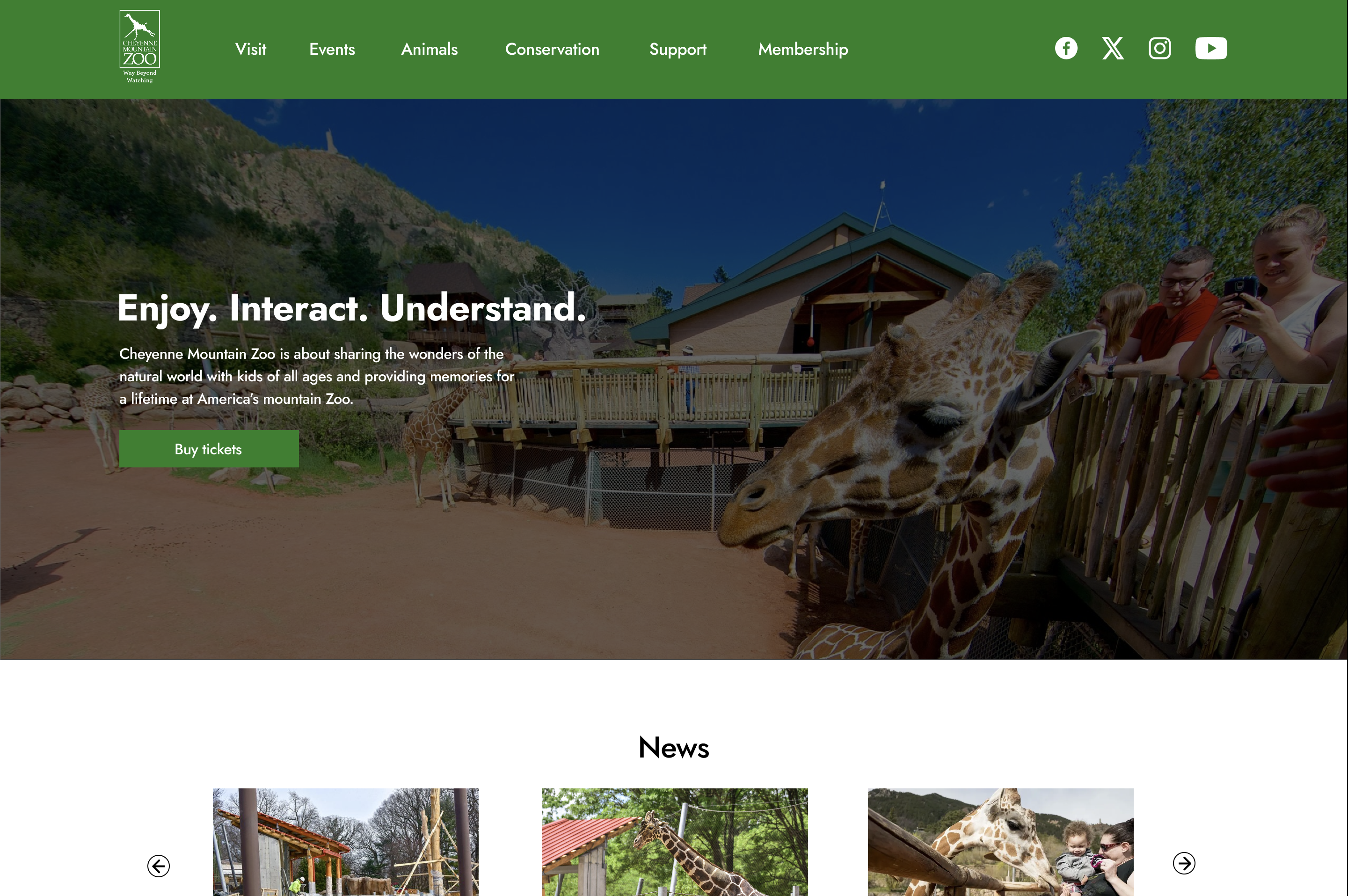
Home page
Introduction
Summary: This project is a case study involving the redesign of the Cheyenne Mountain Zoo website and it's ticketing experience. I utilized user testing and feedback to create a seamless way for users to purchase zoo tickets.
My role: Researcher, UI/UX Designer
Challenge: I wanted to design a user-friendly experience for this case study. To achieve this, I had to work with the limitations of given info from the actual Cheyenne Mountain Zoo website, as well as the amount of screen space required for a smooth ticket buying experience.
Tools: Figma
Research
Testing of current experience: I conducted 5 usability tests on the current Cheyenne Mountain Zoo website experience. This allowed me to identify crucial pain points such as a non-intuitive date/time selection and an overabundance of information on ticketing pages.
Key opportunities: The pain points allowed me to think about creative ways on how to utilize screen space for a seamless ticketing experience, and how to give users the control of how much information they want to see on a page.
How might we statement: How might we provide an non-intrusive ticketing experience to our users, from selection to payment?
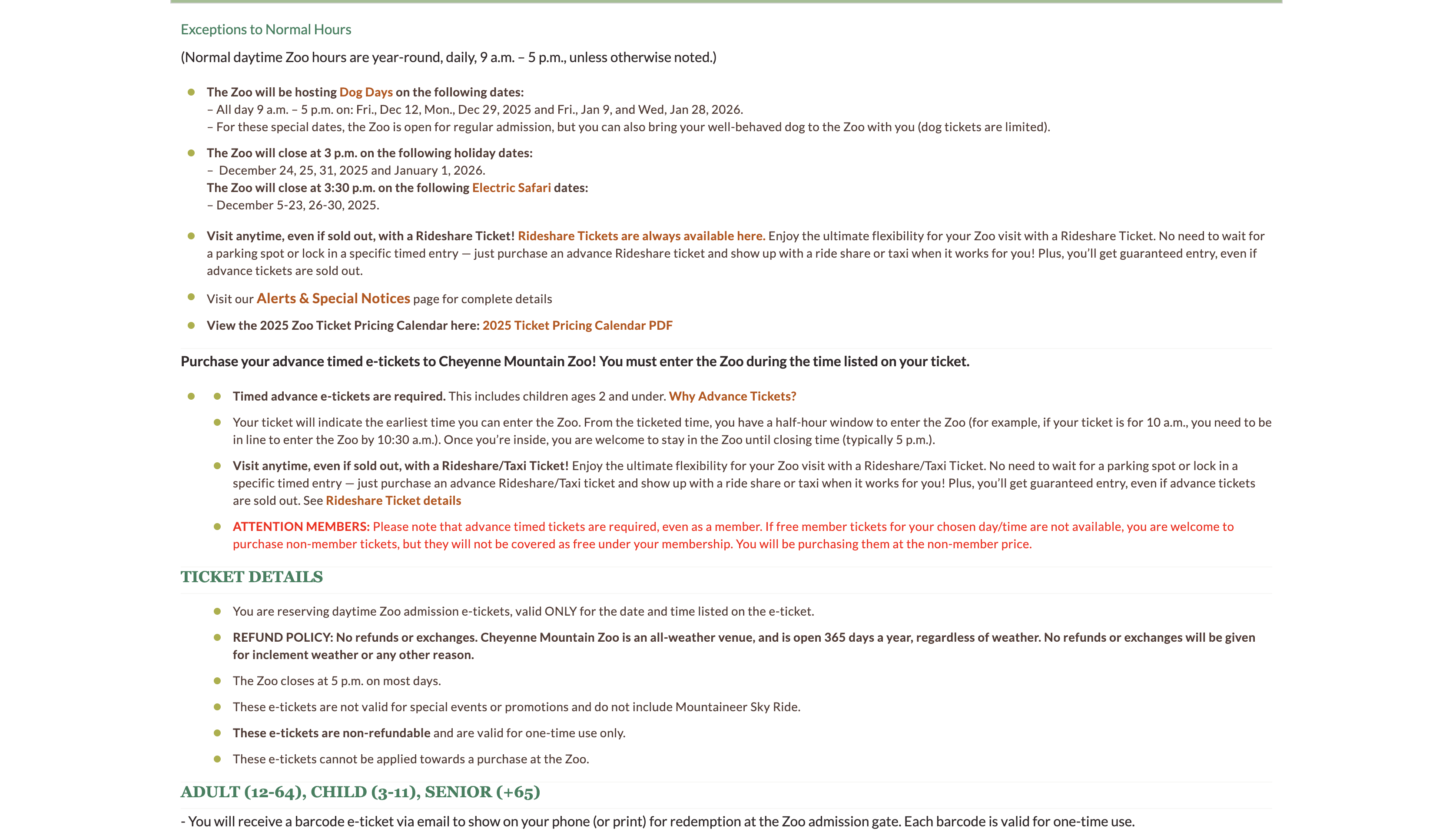
Original CMZoo page for ticket info
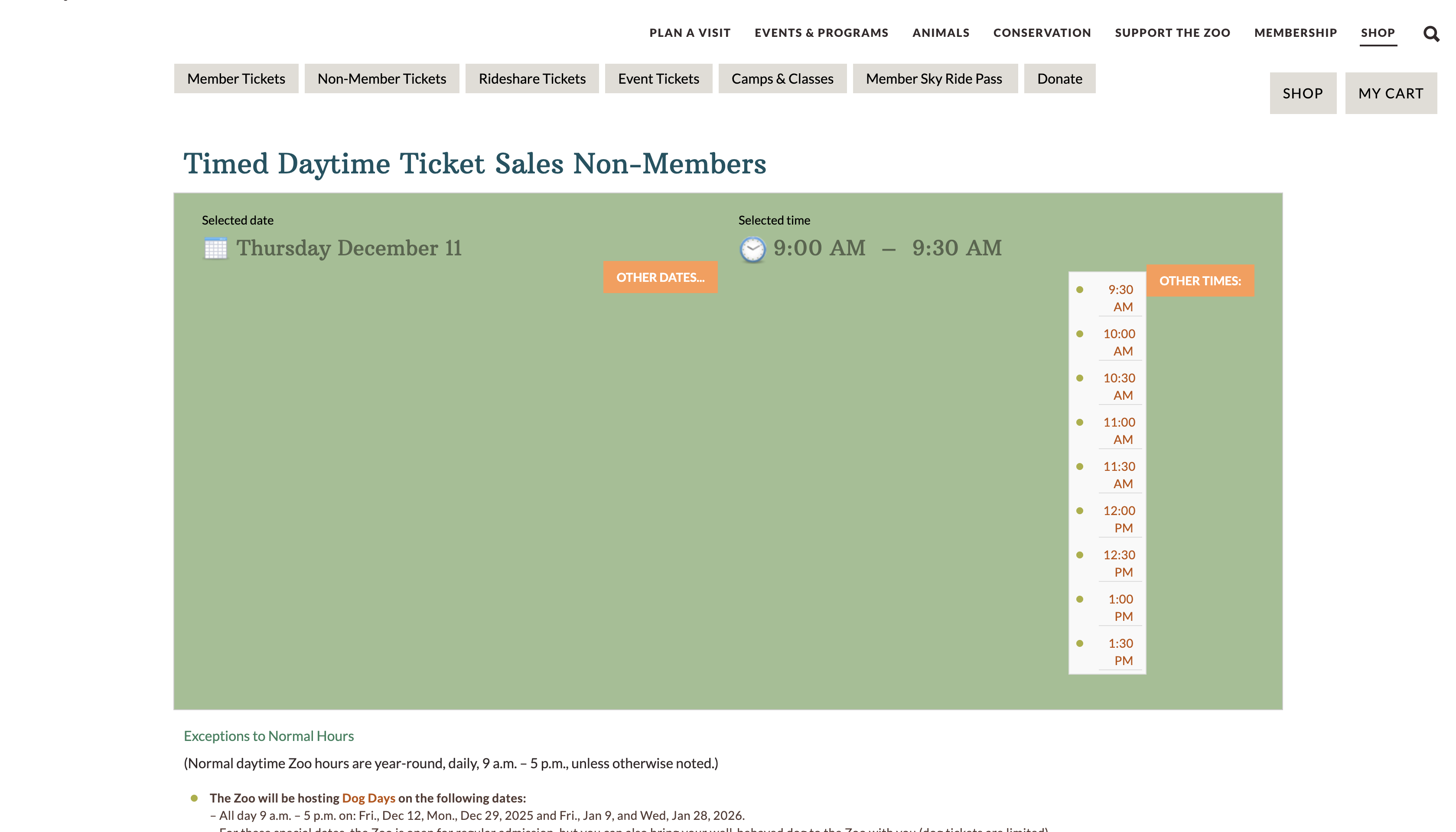
Date/Time selection on CMZoo page
Design
Problem statement: Zoo-goers need an efficient way to schedule and purchase tickets because they can't wait to connect with amazing animals.
Task flow: This flow demonstrates the user experience from start to finish. Certain design situations needed to be made, such as figuring out when users should enter in their ticket amount and select a date/time. This also provides a structure on how pages should be navigated throughout the ticketing experience.

Task flow
Low-fidelity wireframes: These frames provide an initial layout of the pages needed for the ticketing experience. This gave me the idea of combining the ticket and date/time selections onto one side and the cart information on the other. Having the cart on the right side of the page for 'Billing info' gives way for a cohesive experience for users.
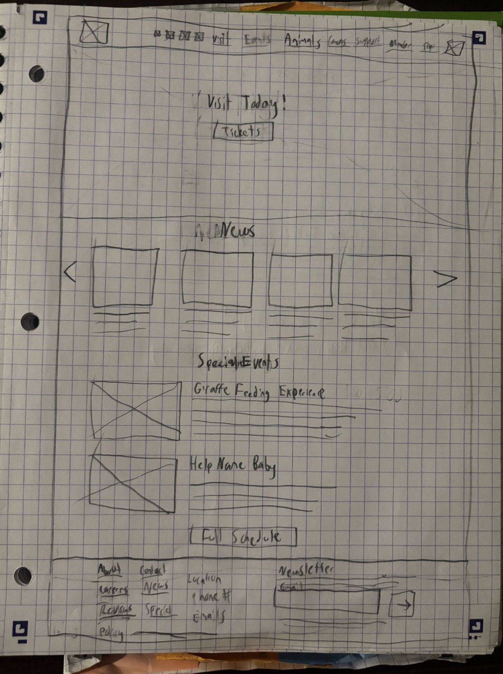
Home page
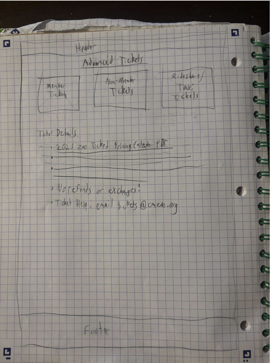
Advanced tickets page
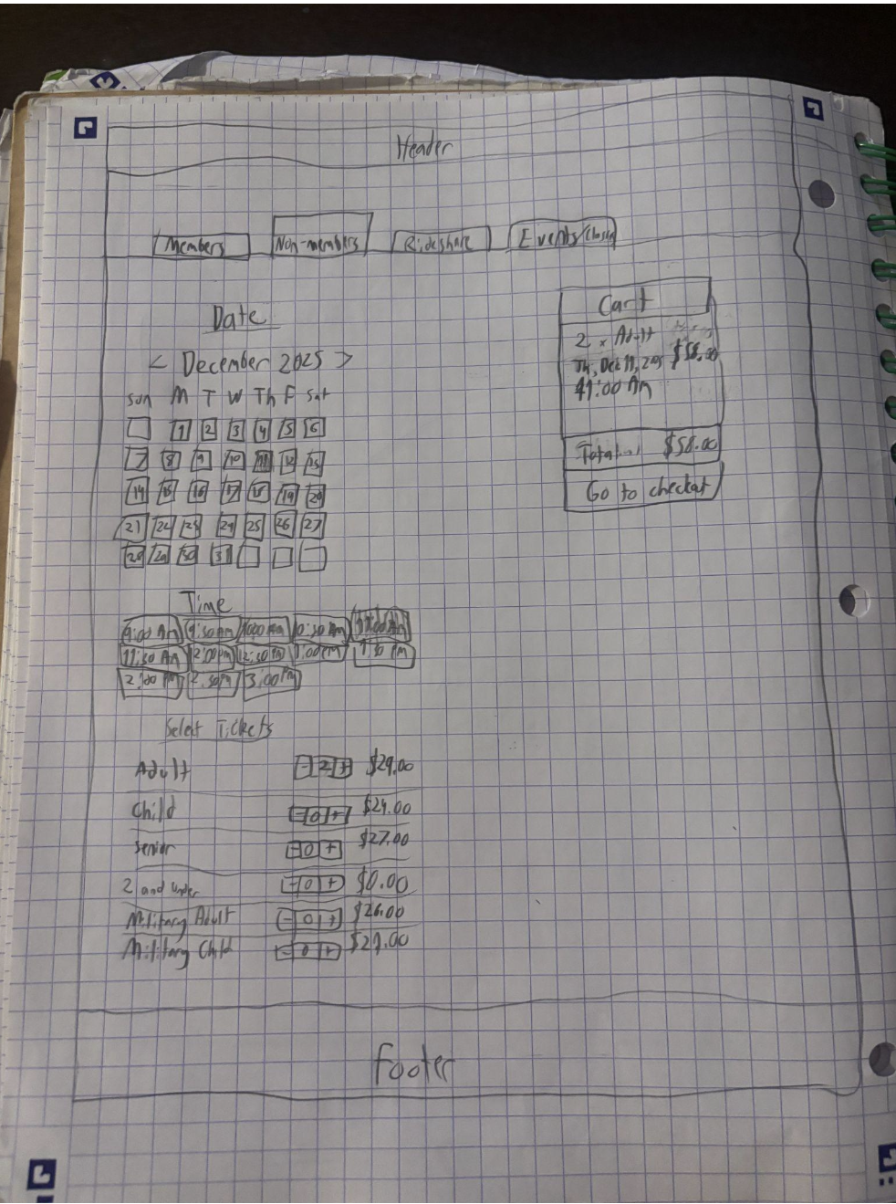
Ticketing
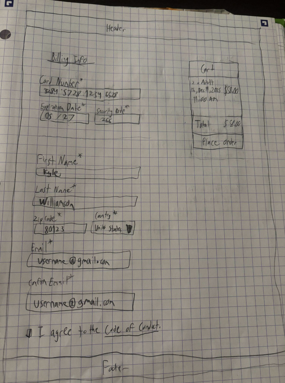
Billing info
Mid-fidelity wireframes: I translated my low-fidelity frames into mid-fidelity ones using Figma. One change I made was to have ticket selection before date/time selection. This change accounts for the scenario when tickets may or may not be available on certain dates and times.
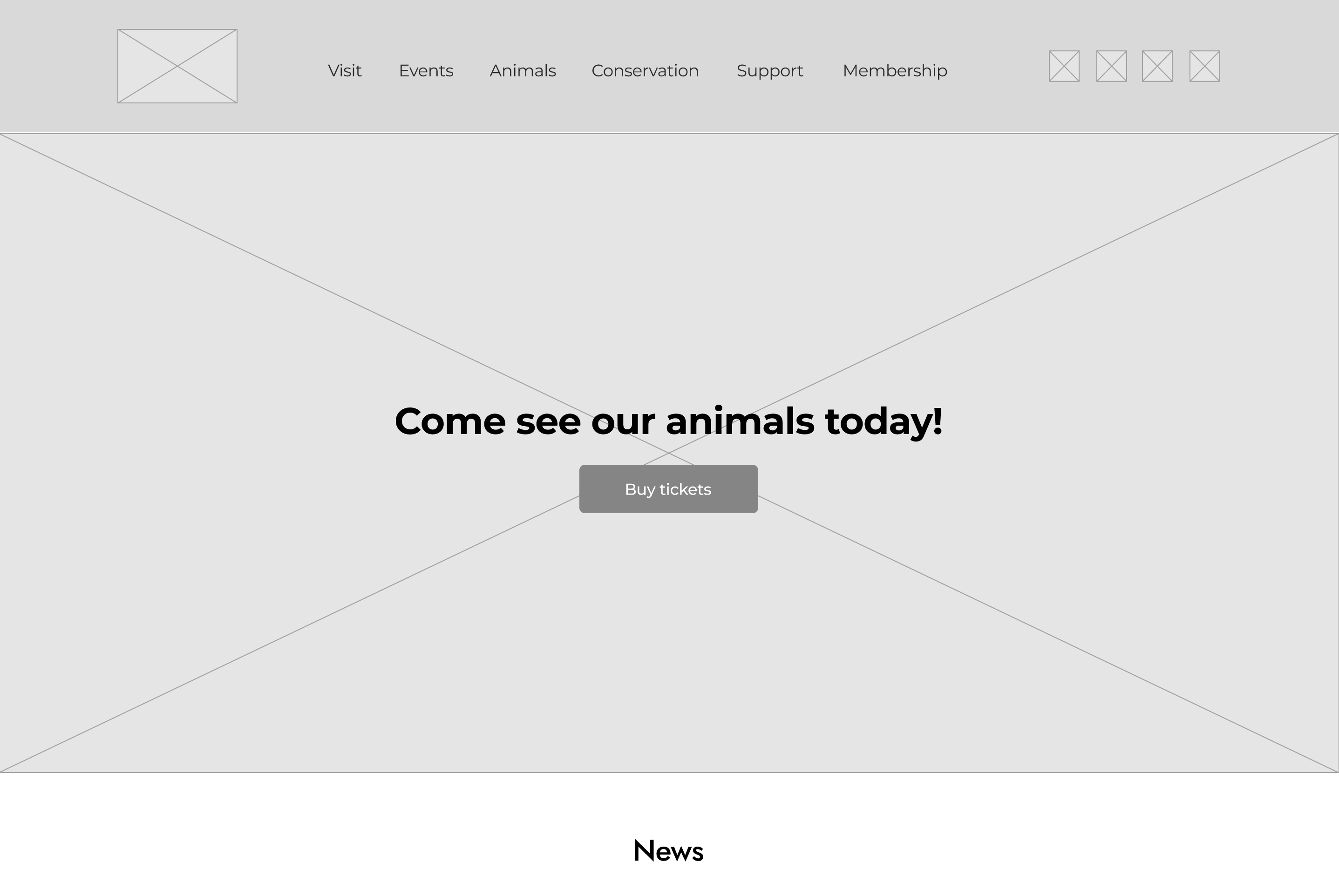
Home page
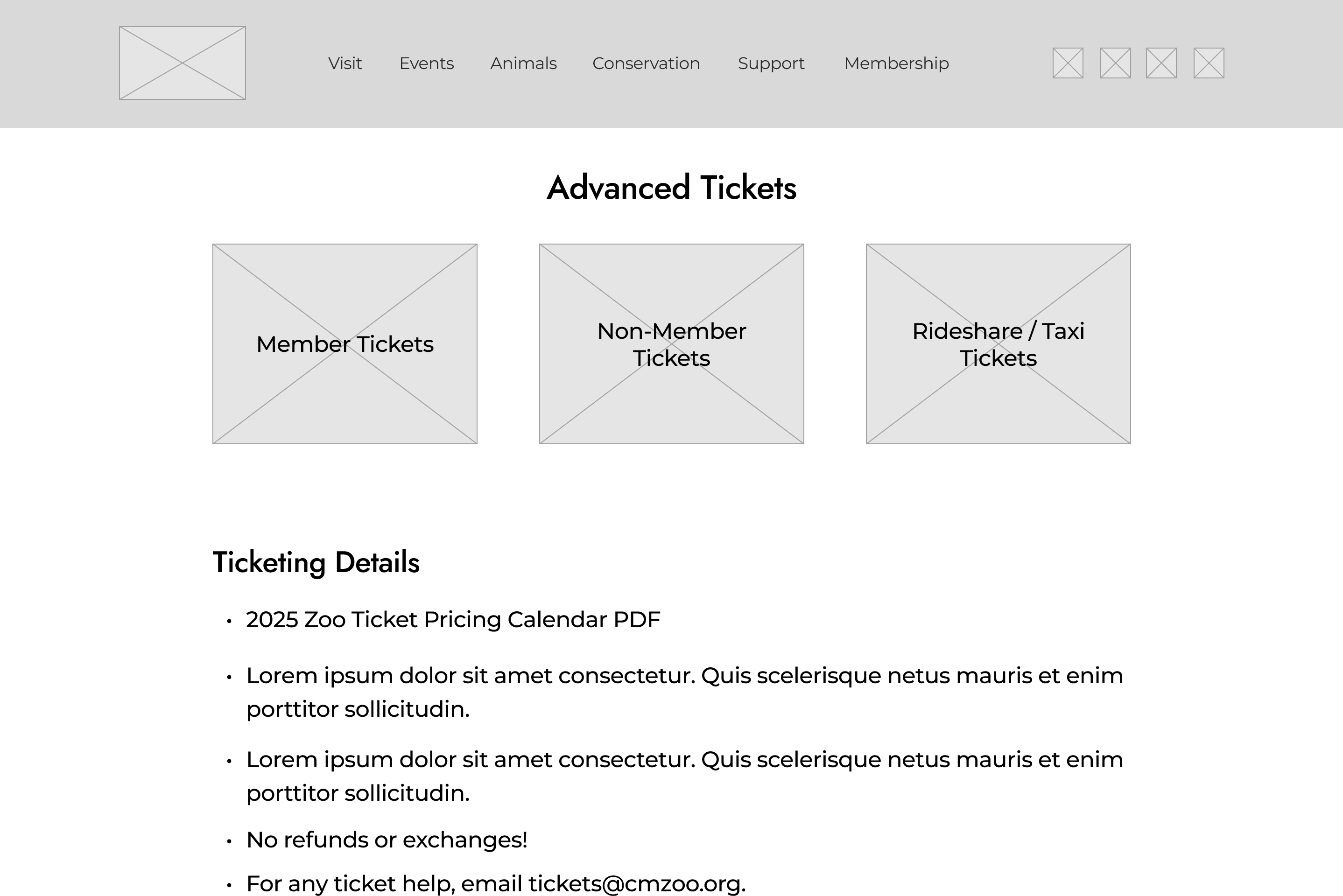
Advanced tickets page
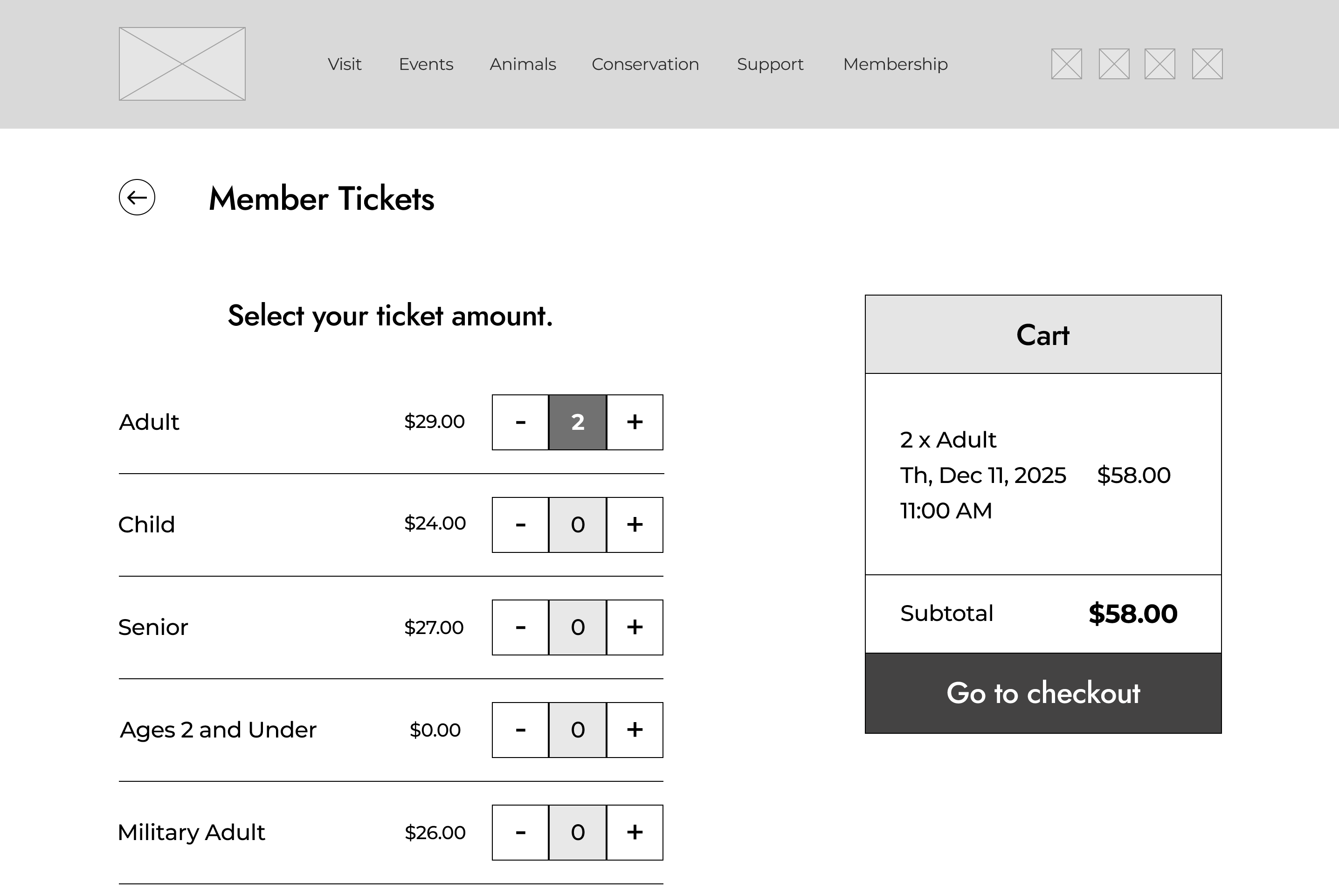
Ticketing
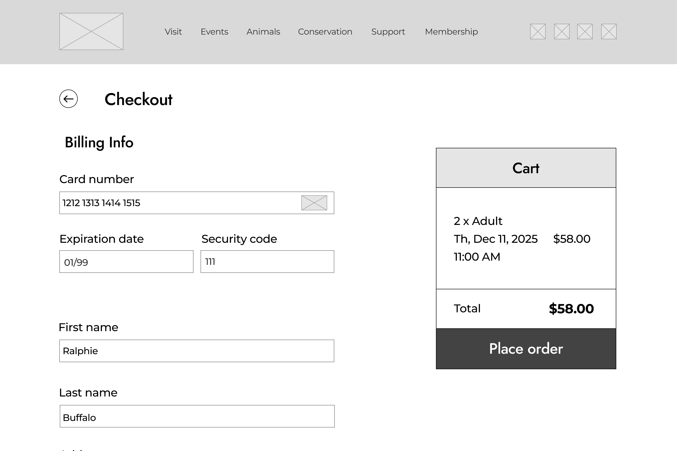
Billing info
High-fidelity wireframes: I figured out a font and color scheme for the high-fidelity frames, and added images/content to my pages. I also took instructor feedback, such as a change in navbar size and the usage of different colors for certain components. User tests were performed, and I worked with the pain points of hero image size and additional page content/functionality.
Home page
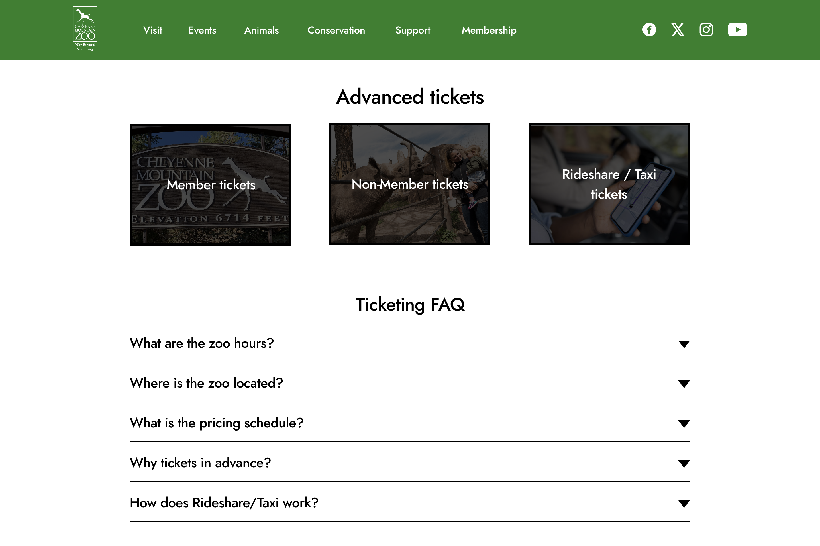
Advanced tickets page
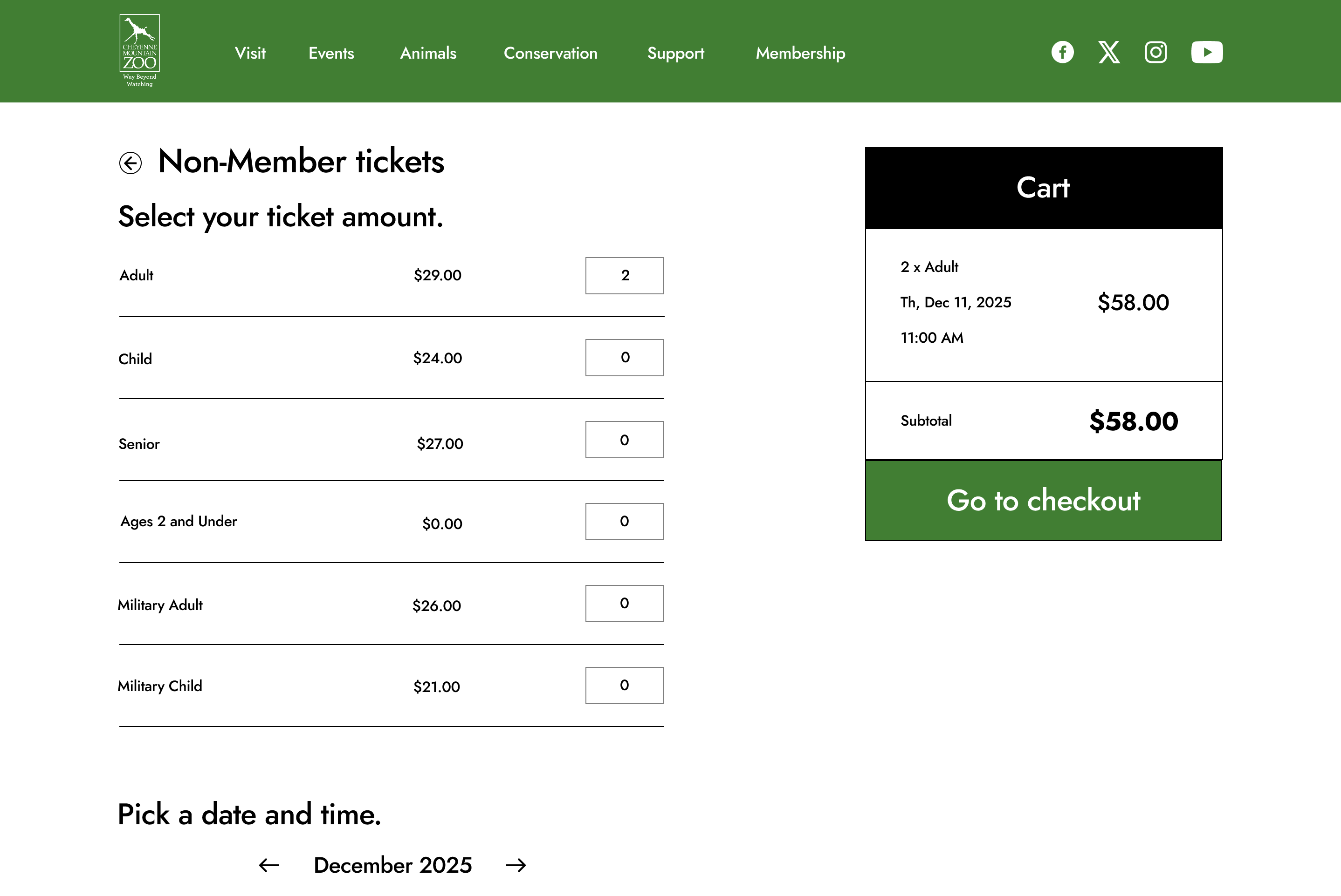
Ticketing
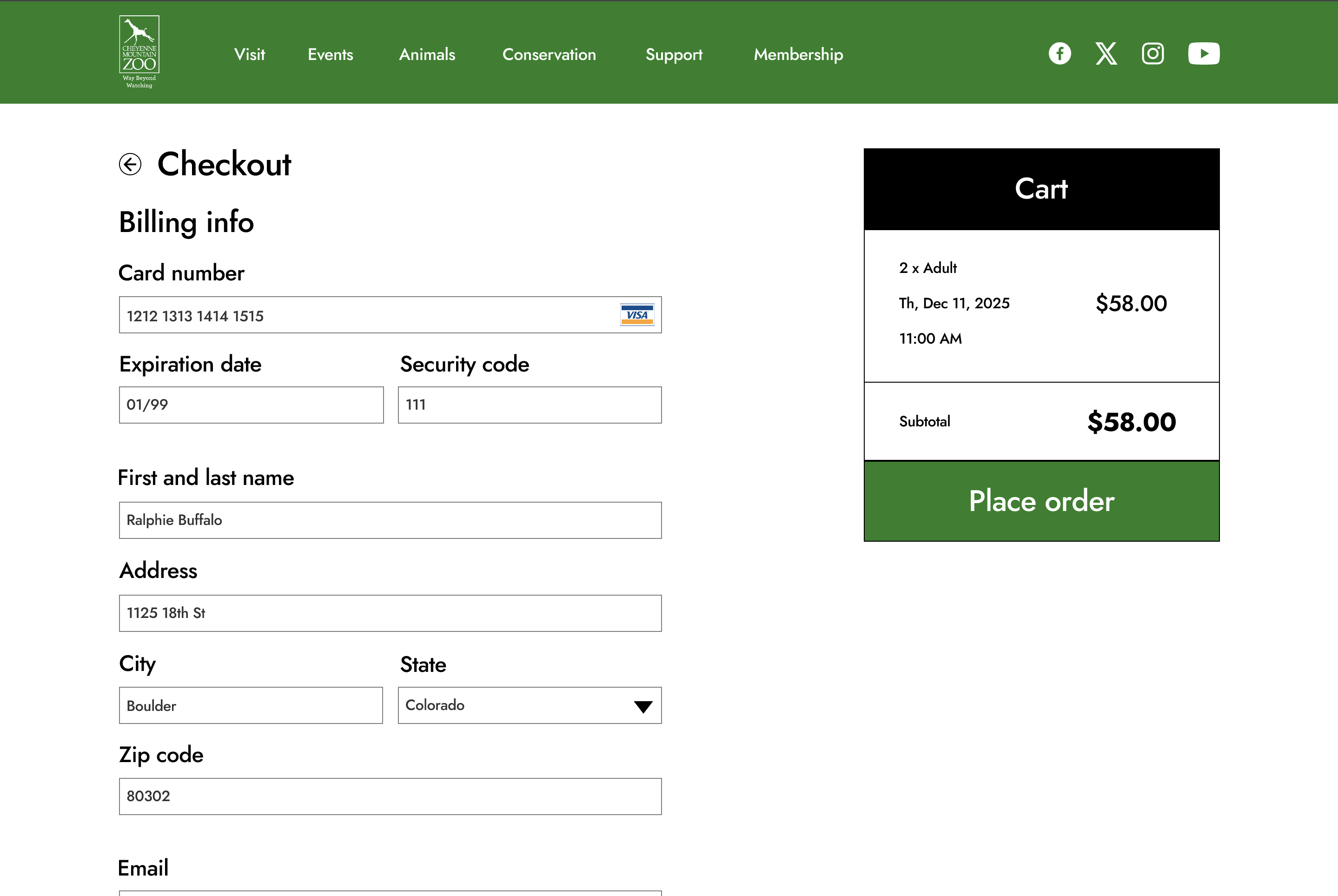
Billing info
Instructor feedback: Throughout the design process, I understood that spacing and color choices needed to be optimized. Therefore, I made sure tighten up the spacing of the 'Billing info' page, and switched colors for the footer and cart components. This allows for easier visibility/hierarchy for users.
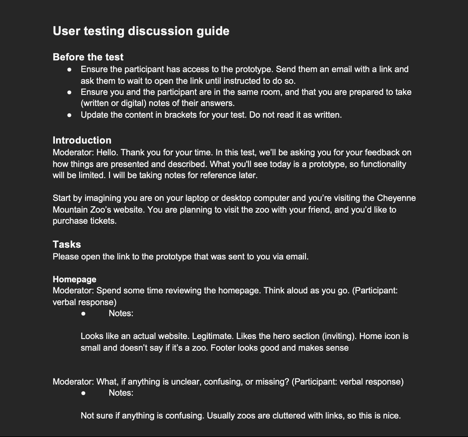
User testing notes
Evaluation and results
User testing process and pain points: My testing process involved performing multiple user tests for both the original CMZoo website and my own design. Users noted the overabundance of content, as well as the ineffectiveness of the ticketing process. Overall, the original website needed a full design refresh.
Updates: I altered my design by reducing the abundance of content on each page, and by implementing a consistent ticketing process by having input fields on the left side of the screen, and the cart on the other. One way I handled the content problem is by utilizing a drop-down design on the 'Advanced tickets' page.
Reflection
Future plans: My next step would involve getting instructor/peer feedback for any additional pain points I missed. For example, I could further optimize the content and spacing of the footer. If I had more time, I could take the extra step of developing the design with HTML/CSS/JS.
Conclusion: This project gave me a structured roadmap on how I should handle UI/UX designs and redesigns. I now know about the importance of having low, medium, and high fidelity wireframes towards finalizing designs. I now have a stronger backbone towards design when I am working with web development projects.